Design
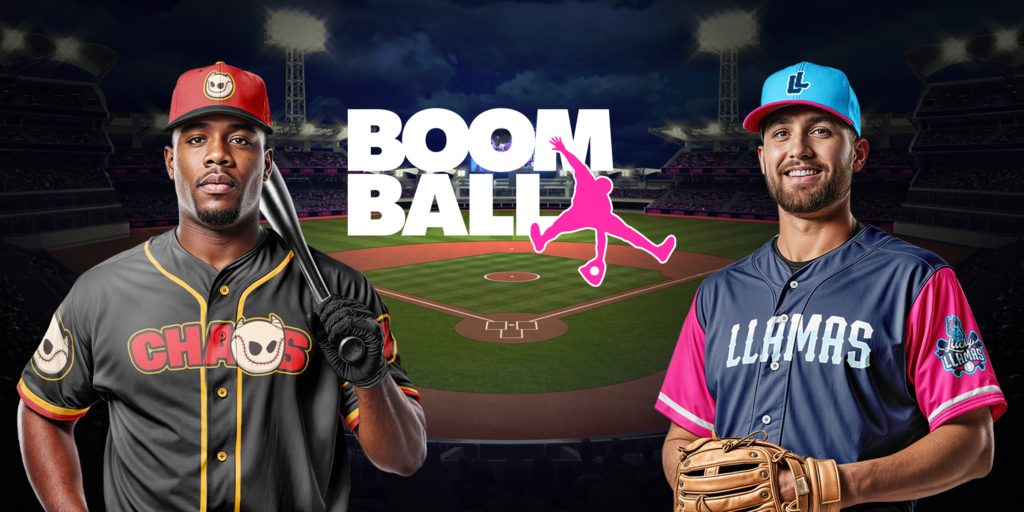
Boom Ball
A new baseball league built around entertainment, energy, and fan-first spectacle. I was brought in to design a scalable brand system capable of supporting a growing league, multiple teams, and real-world applications.
A new baseball league built around entertainment, energy, and fan-first spectacle. I was brought in to design a scalable brand system capable of supporting a growing league, multiple teams, and real-world applications.
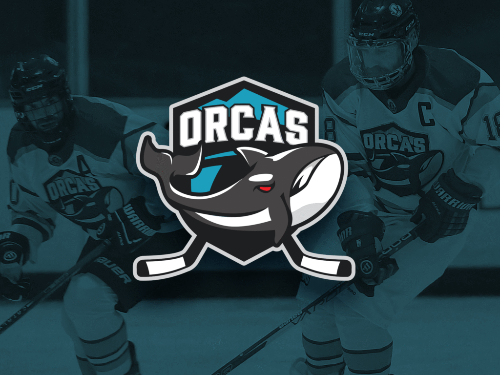
What started as a few players looking to extend the fun turned into a full-fledged team with a competitive spirit, and the gear to match.
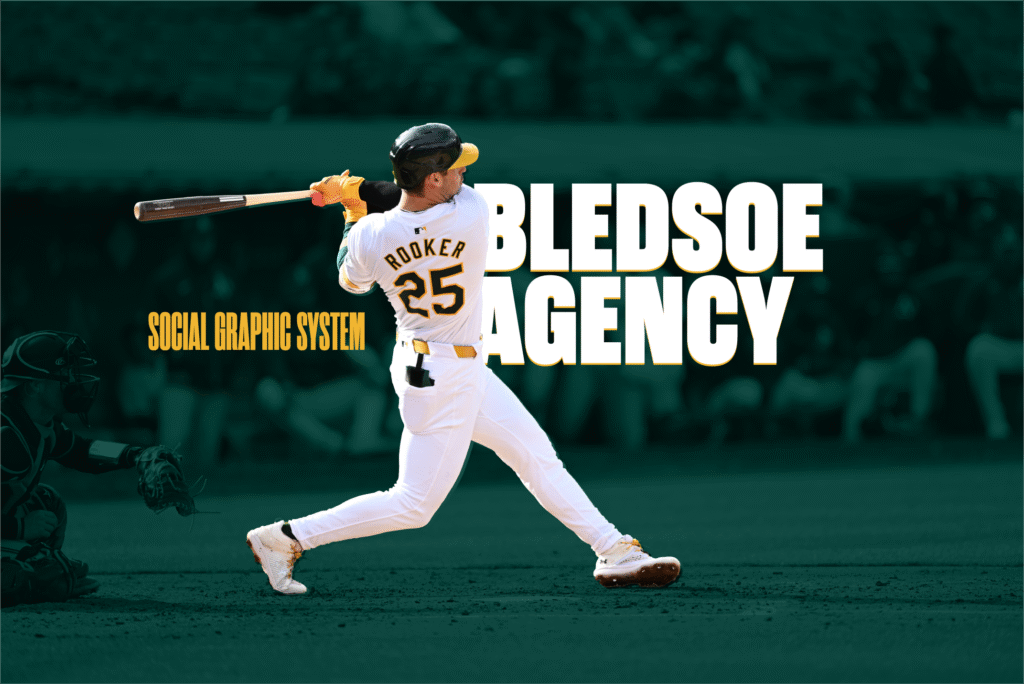
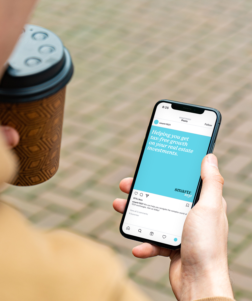
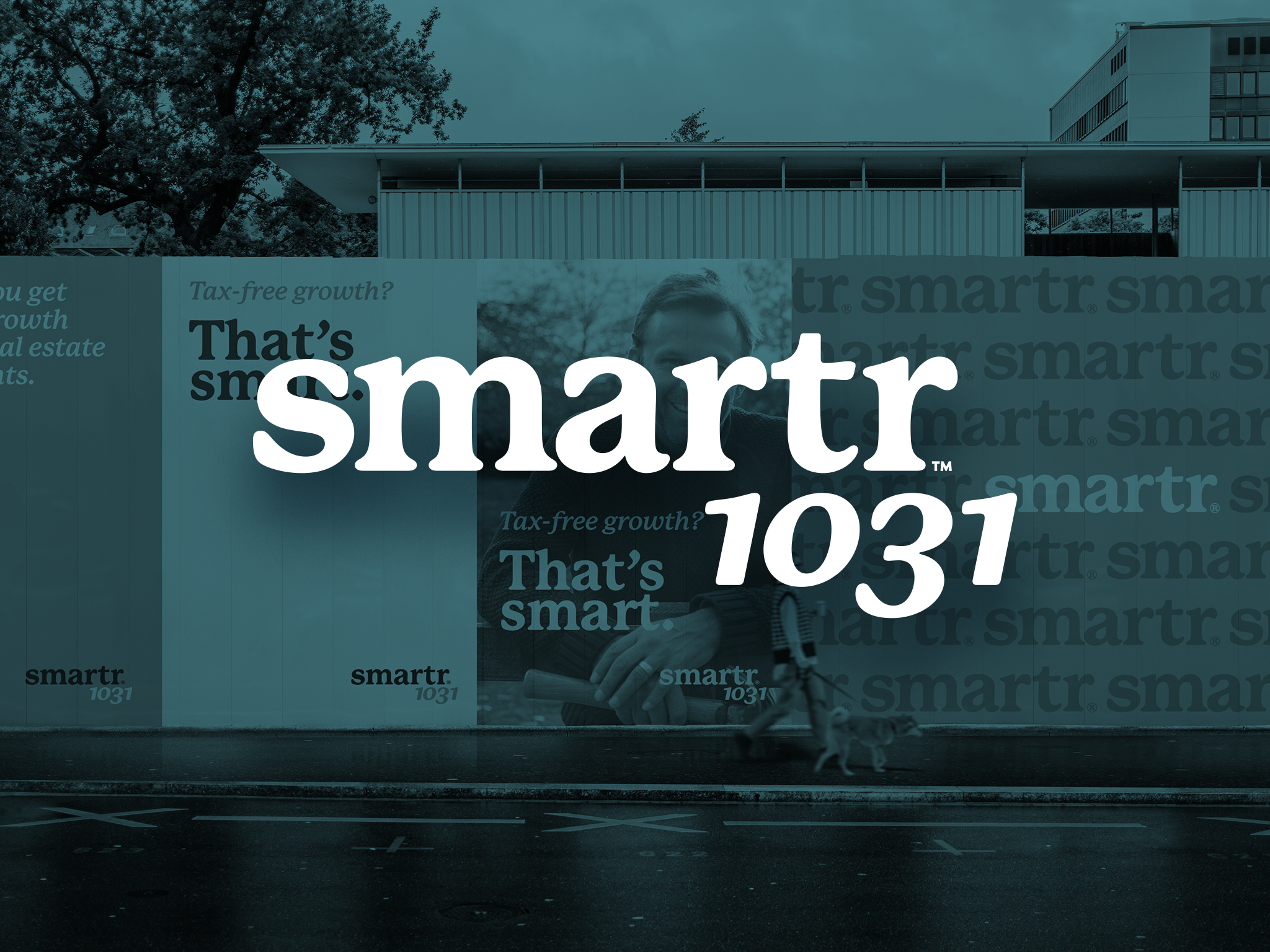
A fast-rising sports agency needed a social media system as dynamic as its roster. We built a brand toolkit designed for power, speed, and serious versatility.