Design
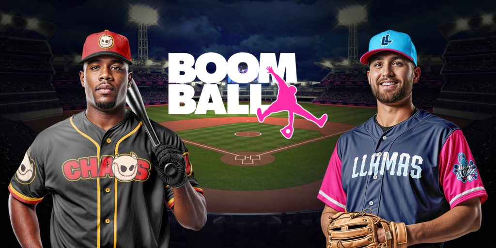
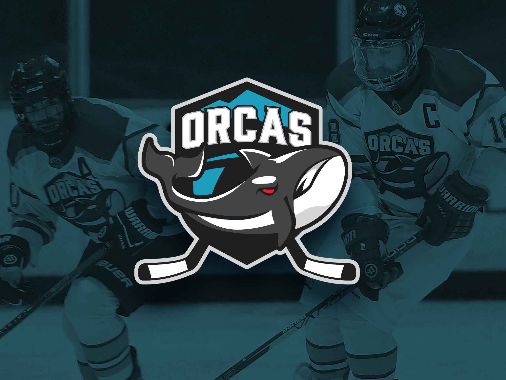
Boom Ball
A new baseball league built around entertainment, energy, and fan-first spectacle. I was brought in to design a scalable brand system capable of supporting a growing league, multiple teams, and real-world applications.
A new baseball league built around entertainment, energy, and fan-first spectacle. I was brought in to design a scalable brand system capable of supporting a growing league, multiple teams, and real-world applications.
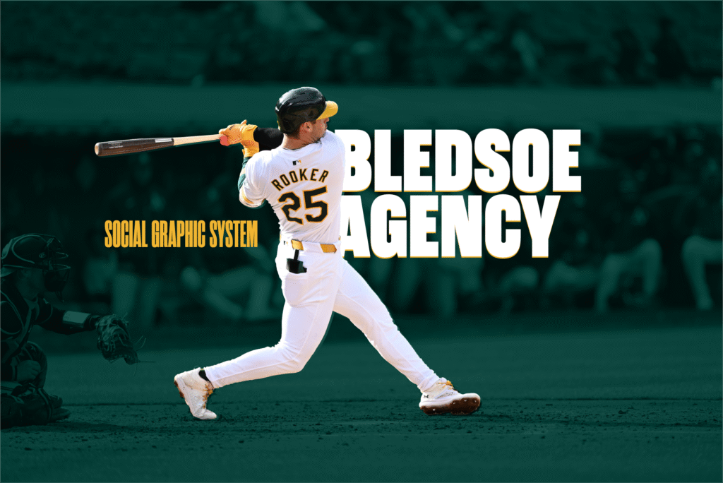
A fast-rising sports agency needed a social media system as dynamic as its roster. We built a brand toolkit designed for power, speed, and serious versatility.
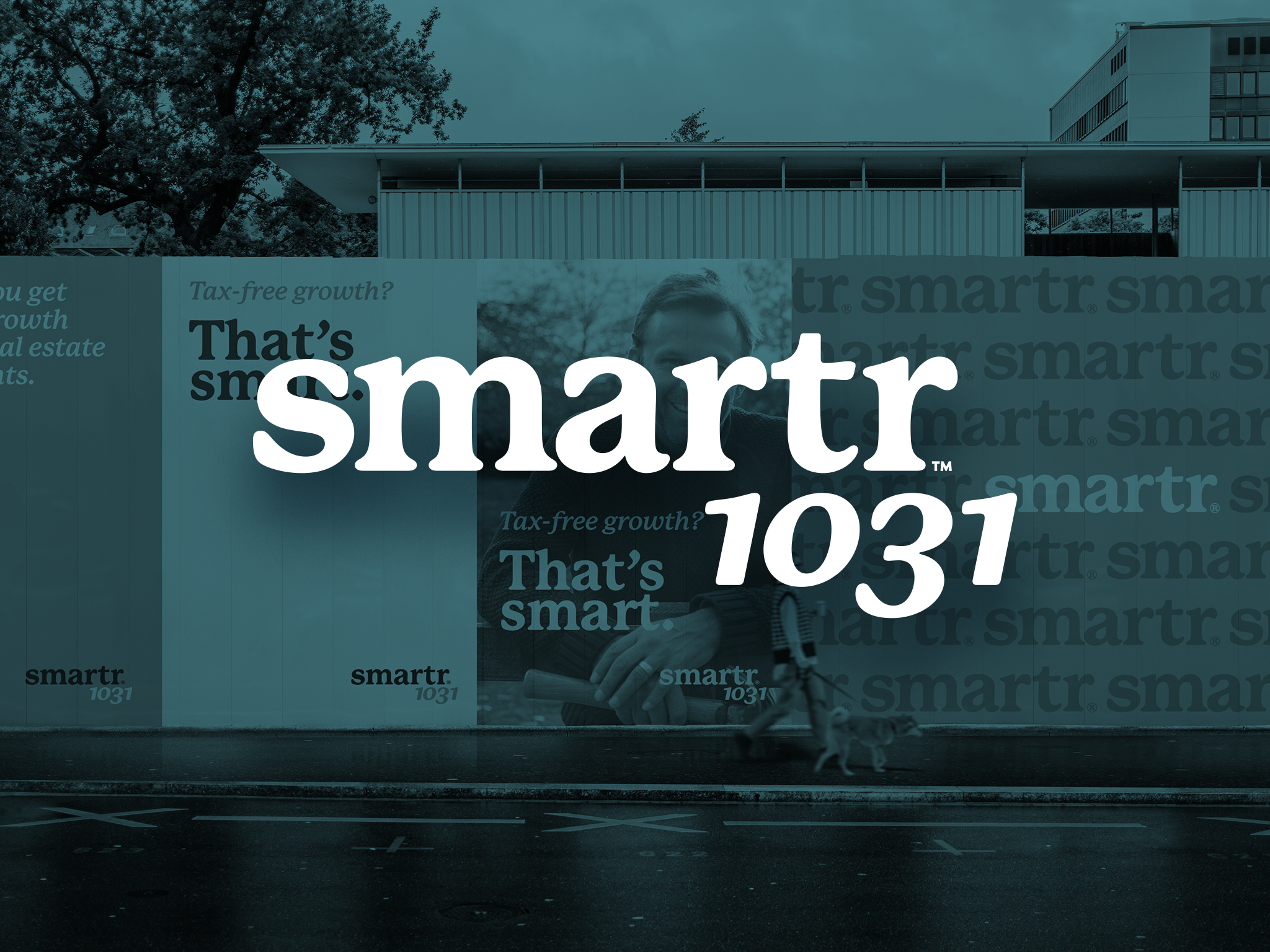
Smartr1031 was ready to disrupt the investment space—but their brand was holding them back. We crafted an identity system that built trust, cut through industry jargon, and made a complex product feel clear, modern, and approachable.